
Ontra - Design in Legal-tech
Design for Legal Tech. UX + Machine Learning
Summary
& End Results
Background
Ontra (formerly Incloudcounsel) is a fast-growing enterprise software leveraging AI technology and efficient digital tools. Their approach shifts legal processing from a physical task to a computation transaction.
Outcomes
To unify years of design ideas from users and Ontra teams I established shared design resources through research- starting with personas, journey maps, wireframes, and interviews with the major stakeholders.
This research allowed us to align on outcomes and prioritize our solutions. To begin testing I turned to Sketch and Invasion for visually accurate prototypes. After efficient user testing and customer feedback, we had crafted a final design that integrated seamlessly with the existing product, provided automation, flexible tracking, and increased user efficiency.
My Role:
Researcher
UX Designer
My Team:
6 Engineers
Head of Product
My Tools:
Sketch, Invision, Zeplin
My Timeline:
2 weeks research
4 weeks design


Complete Story
& Design Process
The Problems
The most common user problem stemmed from coordinating their many legal actions on Ontra. For the “sell-side” customers who might create hundreds of actions a day, this was especially bad. Because of the large amount of leg-work needed, sell-side customers and their legal teams managed thousands of pages, hundreds of timelines, and all correspondences with only email and spreadsheets. In addition to the complications and the amount of labor needed, these tools don’t allow visibility into tracking or how to improve the process.
The Process

Research
Learning from surveys, listening to customers, and creating the tools for successful design
Personas
Design research was new to Ontra, so to establish the value of research I spent the time creating data-driven personas and an interactive customer journey diagram. Each persona was created from account manager interviews and recent customer data. While still only a metaphor for the real customer, these persona's allowed me to estimate user groups for focus analysis and to establish paradigms for what future users might look like.
Customer Journey Map
A comprehensive customer journey has not been completed since the release of several new features. I worked with stakeholders to establish the new flow of customers and established where the biggest pain points were along that journey. The result was a multi-layers journey map allowing users to “zoom” in on the appropriate level.
Design System and Ideal Flows
Along with the journey map, I also documented several common flows from clients. Using these flows and working with Ontra’s Account Management team I was able to establish ways we could package features without disrupting the app’s familiarity.
To ensure all future prototypes and demos were uniform, I translated the current CSS and Javascript components into a first design system. The system was organized after Brad Frost’s Atomic Design and used Zeplin to export from Sketch. organized with this small addition allowed for consistency in testing and our live releases.
Define
Analyze research and prioritize into design principles
While the research was extensive, by formalizing and mapping major insights into artifacts of research like the journey map, I was able to quickly and unify the expectations of my team. However, most importantly I was able to confirm our user’s priorities and learn from their concerns. One of the most important take-aways was our customer’s trust in familiar tools like excel or outlook and their lack of trust in the modern feel of consumer design. This mistrust went beyond aesthetics, creating resistance to automation, customization over ease of use, and a strong wish to “see” everything.
Based on this analysis and research, we established three design principles that would guide our design:
Create, don’t disrupt
Solutions should create new product features, but not disrupt the current experience
Reduce time and frustration
Solutions should always reduce time and frustration (example: signatures and status updates)
Reveal the parts and the sum
Solutions should give visibility and tracking to the pieces and the whole process
If all of these could be followed, we could also assume that we were creating a space that would produce accurate data for the training models.
Create
Applying design principles to the first design solutions and prototypes
Prototype 1: New Feature, Same Flow
Looking to find the best place for the feature to exist within the current layout, I consulted the existing user flows and account manager. After establishing an understanding of the tool’s current layout, I presented prototypes to several high-traffic users. Referencing the user’s flow and clarifying Ontra’s perceived use as compared to the clients, I was able to quickly iterate design stakeholders agreed upon. The resulting feature fit seamlessly into the existing environment and could manage documents, users, and the list of receivers.
Prototype 2: Easy Send and Recieve
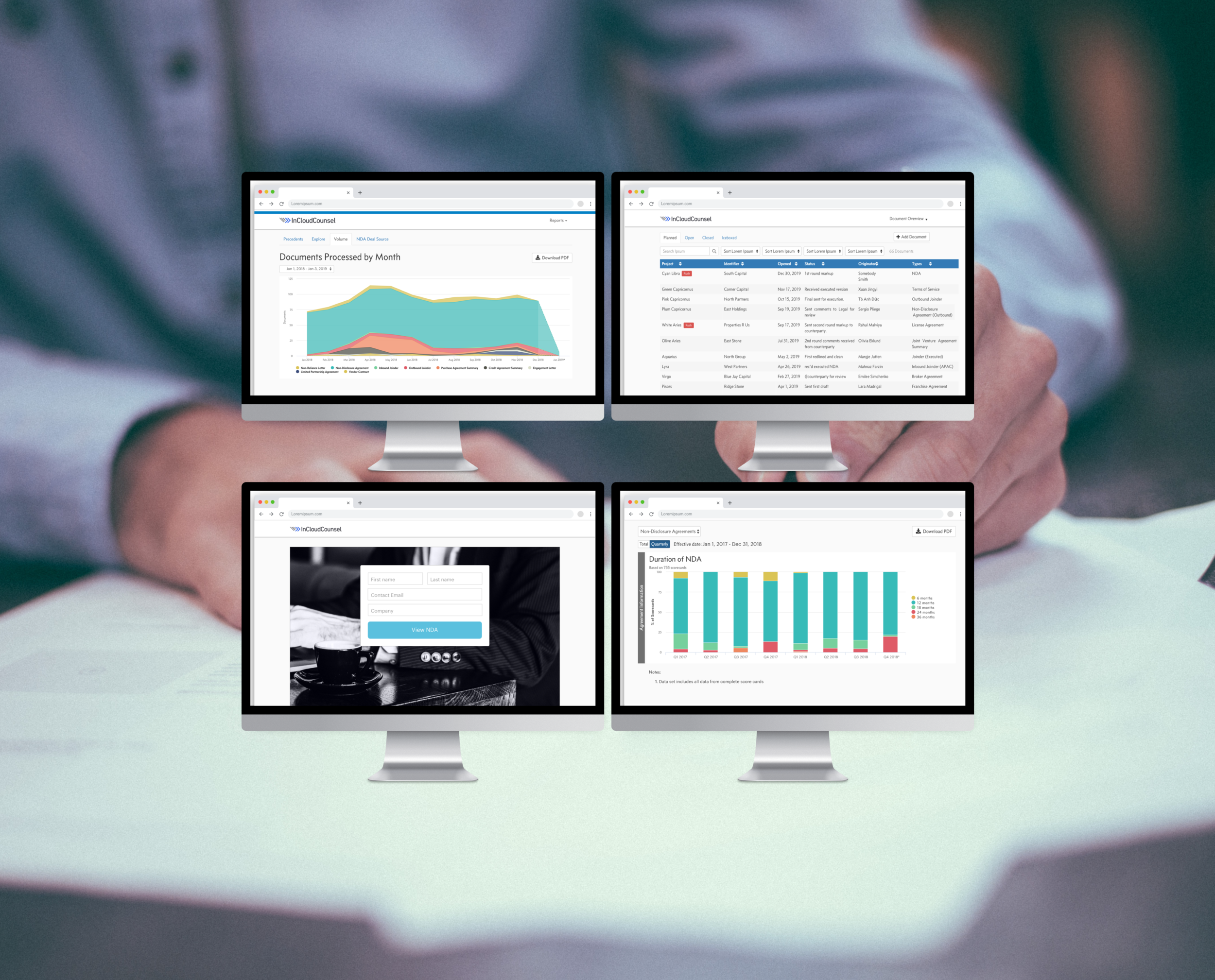
The first prototype allowed users to see the documents already sent and uploaded for an account, prototype two let users actually send those documents, collect signatures, and record their client’s responses. With the new system, updates like “sent,” “received,” or “in progress” were communicated automatically, saving the user time and removing human error from the recording process. While this was automation, it was triggered within custom preferences, giving them flexibility and trust in the results.
Refine
Data visibility and functions for training the machine learning model
Prototypes 1 and 2 brought new functions, but the final refinement brought to life analytics for tracking the actions made by the customers and their teams. From our earlier research, we knew what data was most important to track and from this, I created a prototype mimicking what the data visualization might look like. After several iterations and legal discussions, we developed a tracking display that gave a high degree of fidelity and flexibility.
While seemingly minor, pages were the first layer in validating Ontra’s machine learning model. As documents were reviewed and verified the model would begin to learn exactly how to monitor the data, edit documents, and eventually provide even more automation to the process. However, all of that depending on the users we’ll comfortable and being able to see which documents were purely generated by humans and which were machine-assisted. The fast turnaround time for lawyers receiving a machine’s help we know would eventually be key to the customer’s efficiency.


While seemingly minor, pages were the first layer in validating Ontra’s machine learning model. As documents were reviewed and verified the model would begin to learn exactly how to monitor the data, edit documents, and eventually provide even more automation to the process. However, all of that depending on the users we’ll comfortable and being able to see which documents were purely generated by humans and which were machine-assisted. The fast turnaround time for lawyers receiving a machine’s help we know would eventually be key to the customer’s efficiency.
Outcomes
Final thoughts and takeaways
Working with users, engineers, and product leads, I created solutions that used software to manage the sell-side process, automated status updates, and provided data visibility. While not the project’s goal, perhaps one of the most important results was building the trust clients had for Ontra’s design and showcasing the design team’s prowess. More defined outcomes were:
Enabling users to manage complexity
Breaking a system-wide process into an easily navigable interface that didn’t disrupt any current flow
Less time and more flexibility
Drastically improved efficiency and while still allow customization meant reduced time and frustrations
Data visualizations
A design that provided big-pictures insights and flexible reporting, showing both the part and the whole
Because engineering had been a partner throughout the process, I was well aware of the time, complications, and challenges my designs presented. By presenting the current design in a weekly design review, engineering got first say about new interactions and changes while I was able to adapt elements that would prove to tax on the development side.